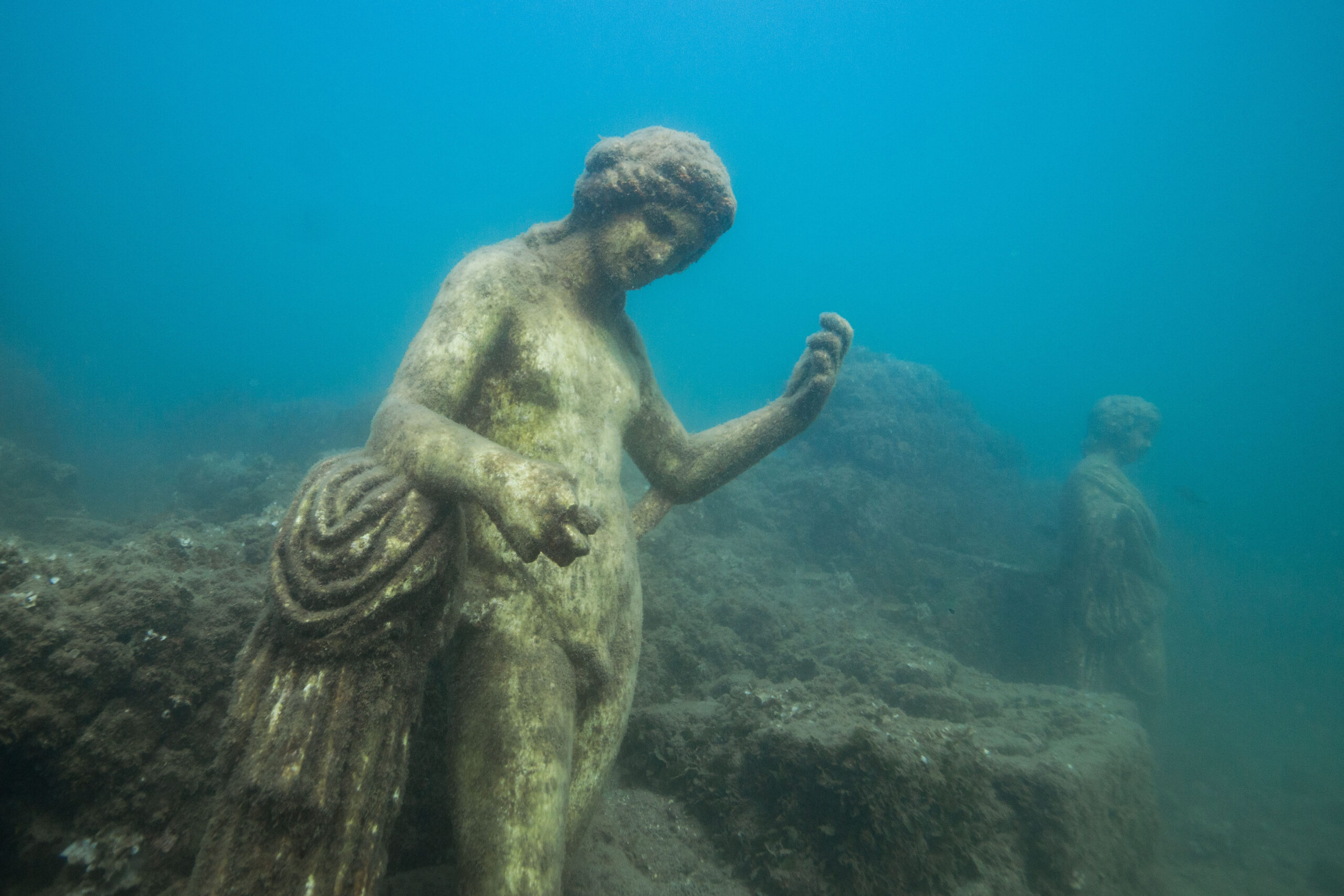
Underwater AR Attraction
Who is Scientific American?
Scientific American is a magazine that publicizes articles about news, opinions, and reports about science. They cover the most important and exciting research, ideas and knowledge in science, health, technology, the environment and society. The very first issue of Scientific American was a weekly issue published in 1845. Then in 1921, Scientific American officially became a monthly issued publication.

Who are the Clients?

Scientific American’s ideal clients are forward thinking, solution-seeking readers who cement trends and set agendas that others follow – they are the Minds that Matter. The target audience has a bias for inductive, abductive and deductive reasoning. In other words they have a bias for scientific thinking. The readers enjoy concrete information about new technology that has just been brought to the surface or upcoming technology that will be available in the future.
Challenges
As a design student I was tasked to visualize a new type of technology that divers can take with them to add digital elements over real-world views. The underwater ruins appear on a screen which the diver takes with them to explore. The main challenge I came across was creating something that looks realistic to the eye but also shows the use of AI technology. Scientific American’s magazine covers all share similar traits. Each cover has a specific template that they follow and all of the covers are realistic images. Whether it’s a person, place, thing or idea, each cover has a similar style.
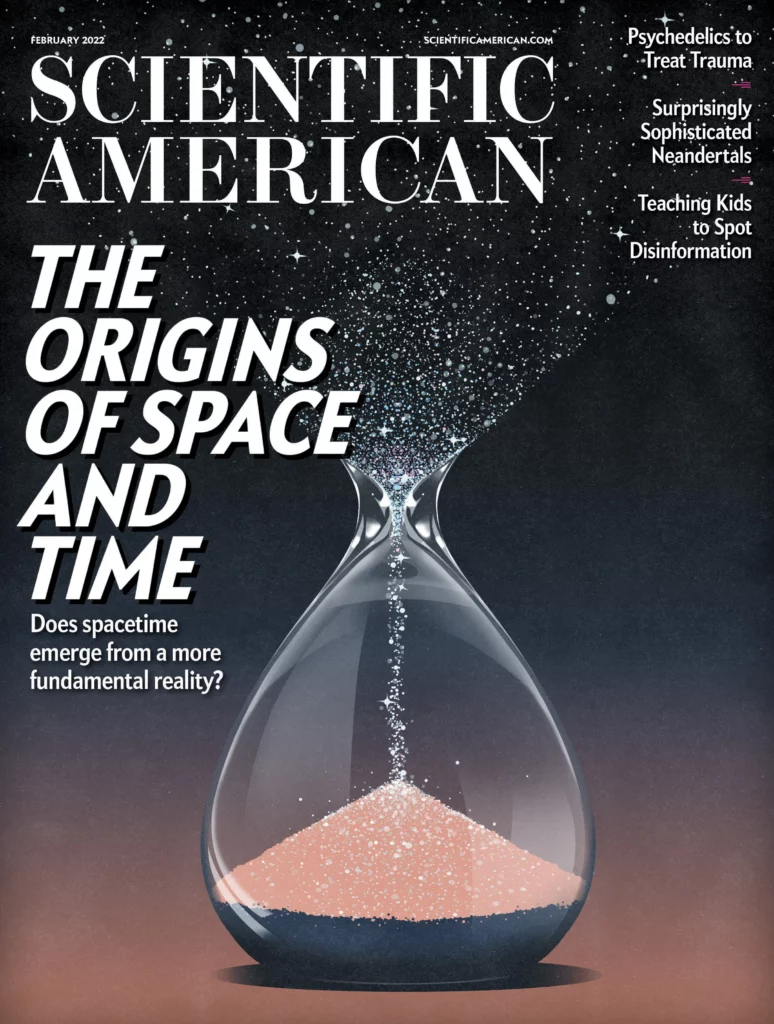
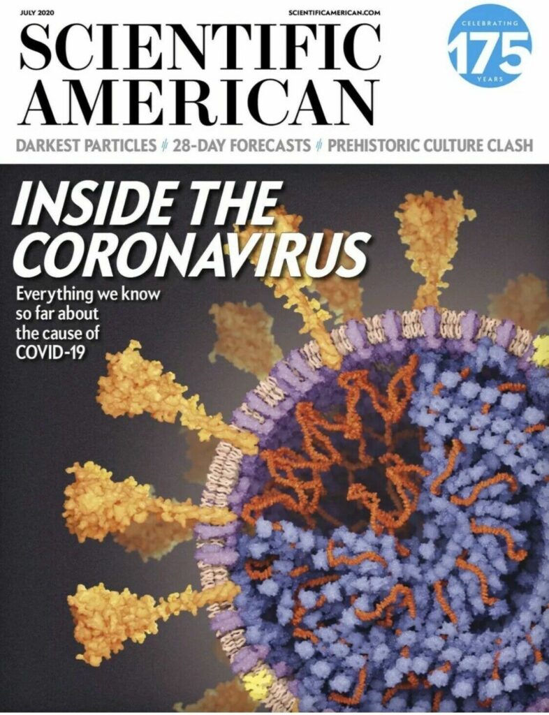
Sketching the Solution
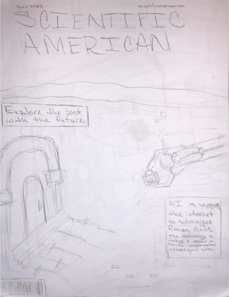
With such an interesting concept their were a few different ways that I thought I could go about tackling this. Sketching is always an important step for me. I am able to draw words or ideas that are in my head that I may have a hard time explaining. At first I thought of doing a very abstract version of this concept. The focus would be a large lens or camera that is overlooking the roman ruins or landscape.
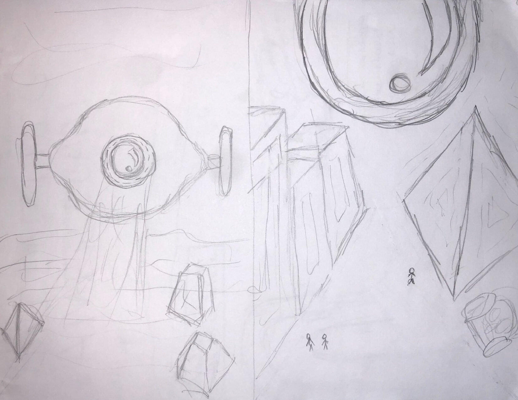
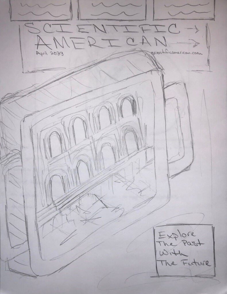
Then I thought of changing the focus to the actual device the diver would take with them. The device would display the ruins on the screen to give the viewer a sense of what the diver would be looking at. Then the thought process changed again and I began to sketch a single structure below the water, with the possibility of a diver exploring the ruins.
Results
Because of the different variations the client was able to select their favorite concept and then also have some input of their own. The client decided to go with the last sketch of the diver exploring the ruins underwater. This idea gave the audience a straightforward view of what the upcoming content would be about.
Photoshop Layouts
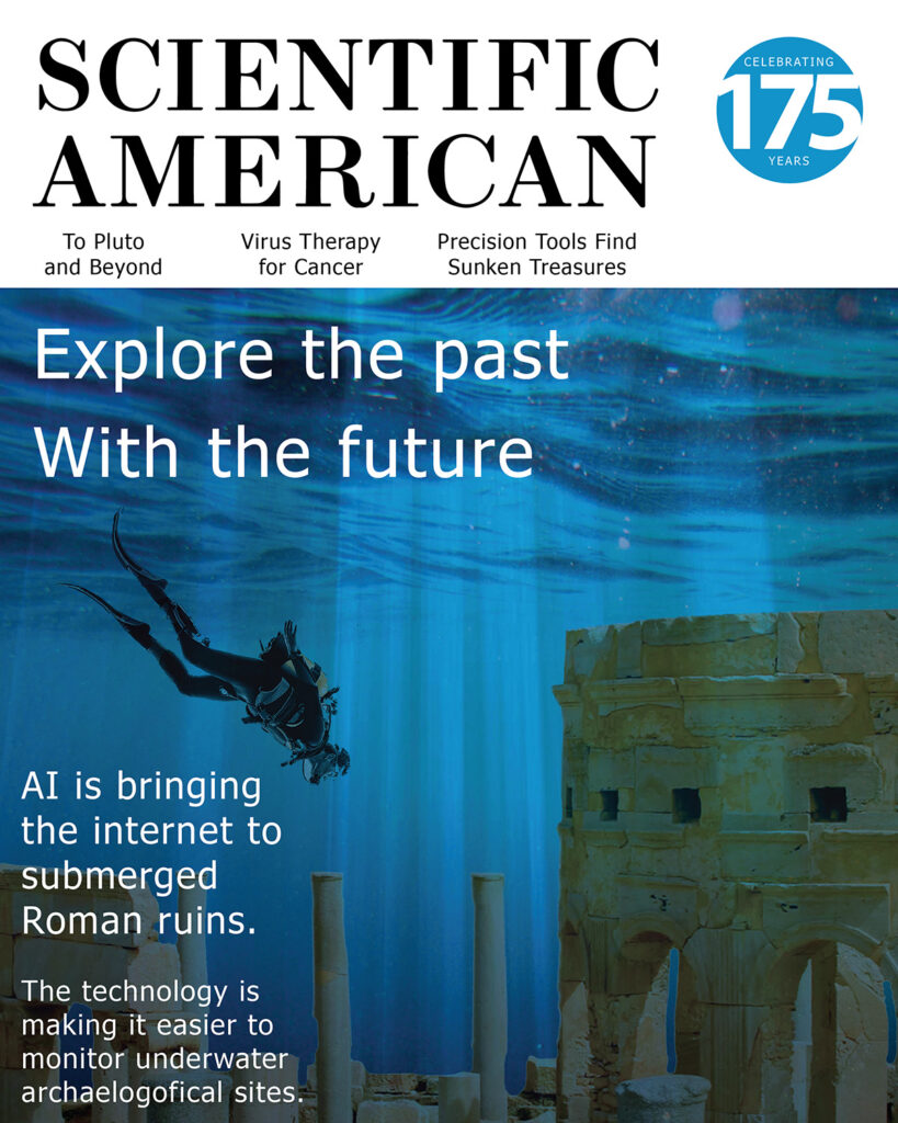
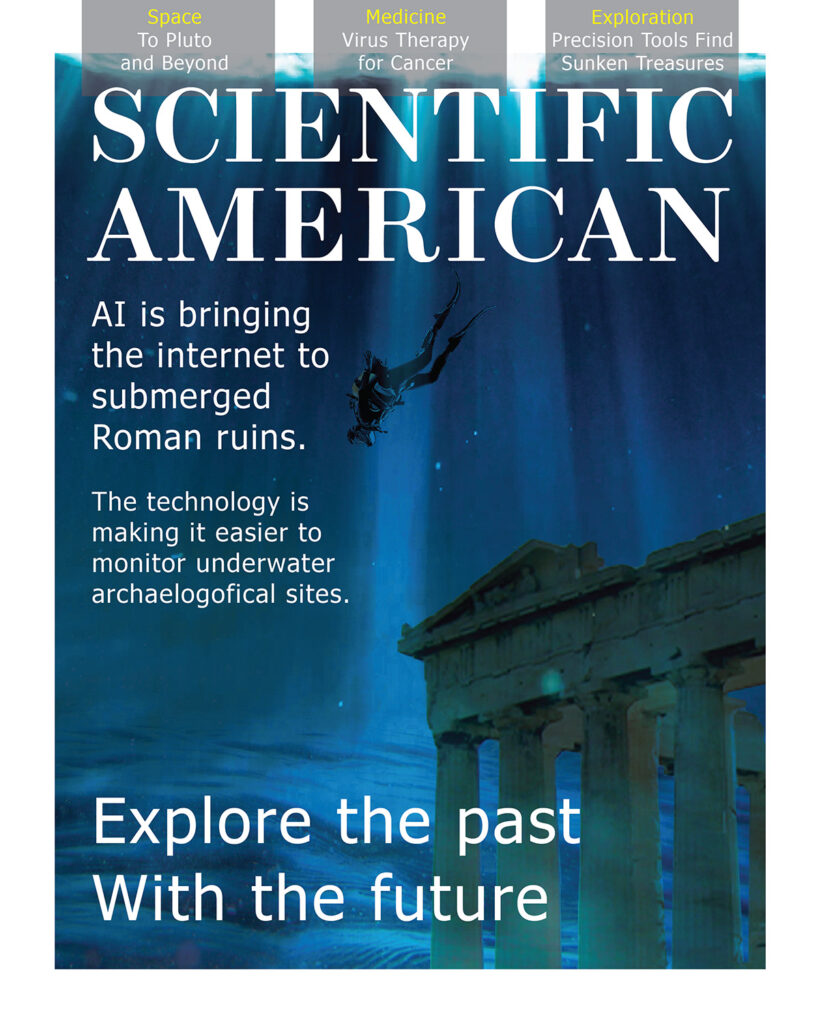
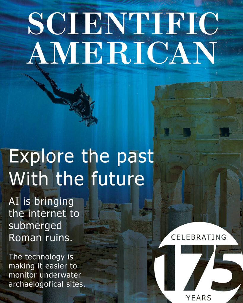
The next step I took for this project was designing a few different concepts that contains the style of Scientific American. This also gave me a better idea of what the final layout would look like.
3D Modeling Process
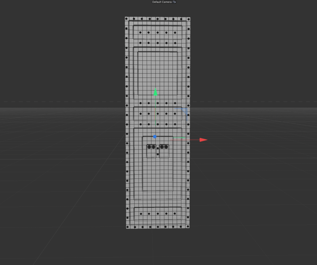
After finalizing the idea with the client I began to design the structure in Cinema4D, which is a professional 3D modeling, animation, simulation and rendering software solution. I started with creating the base of the structure along with the support pillars. Then moved into adding some detail to the structure to give it more depth and texture.
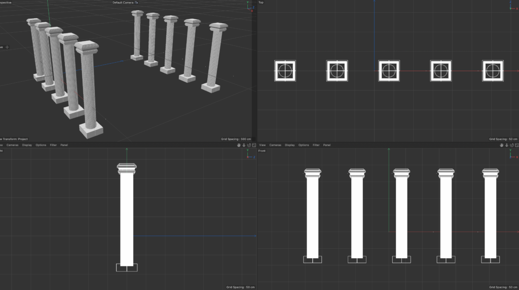
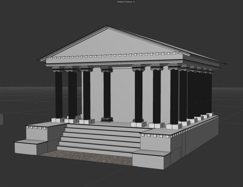
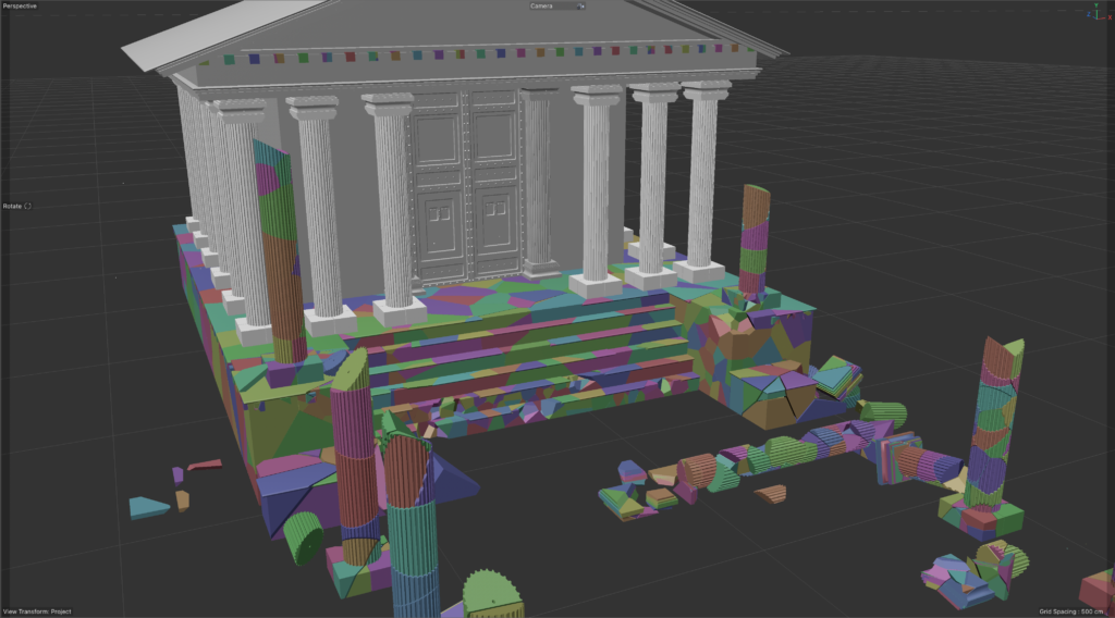
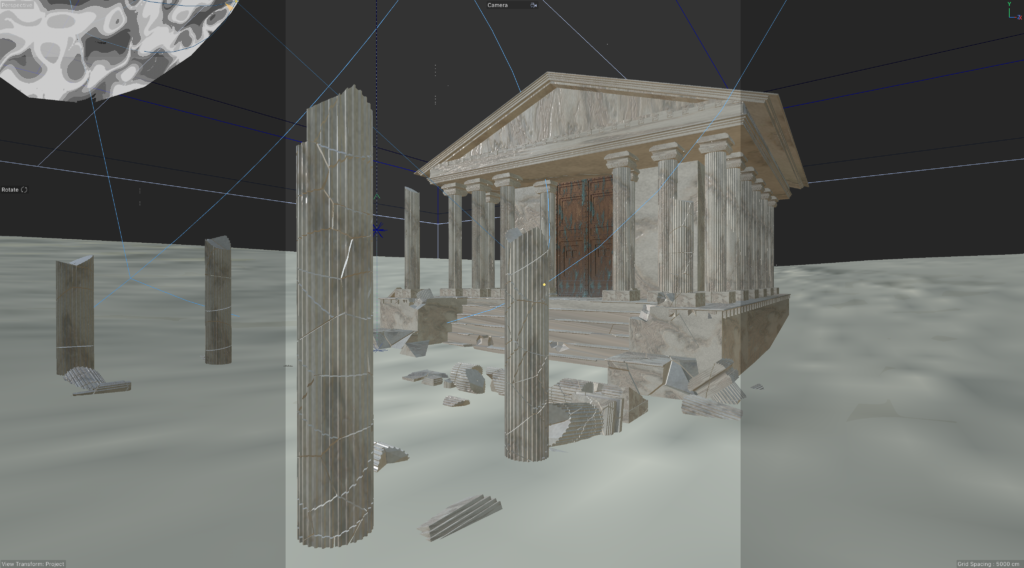
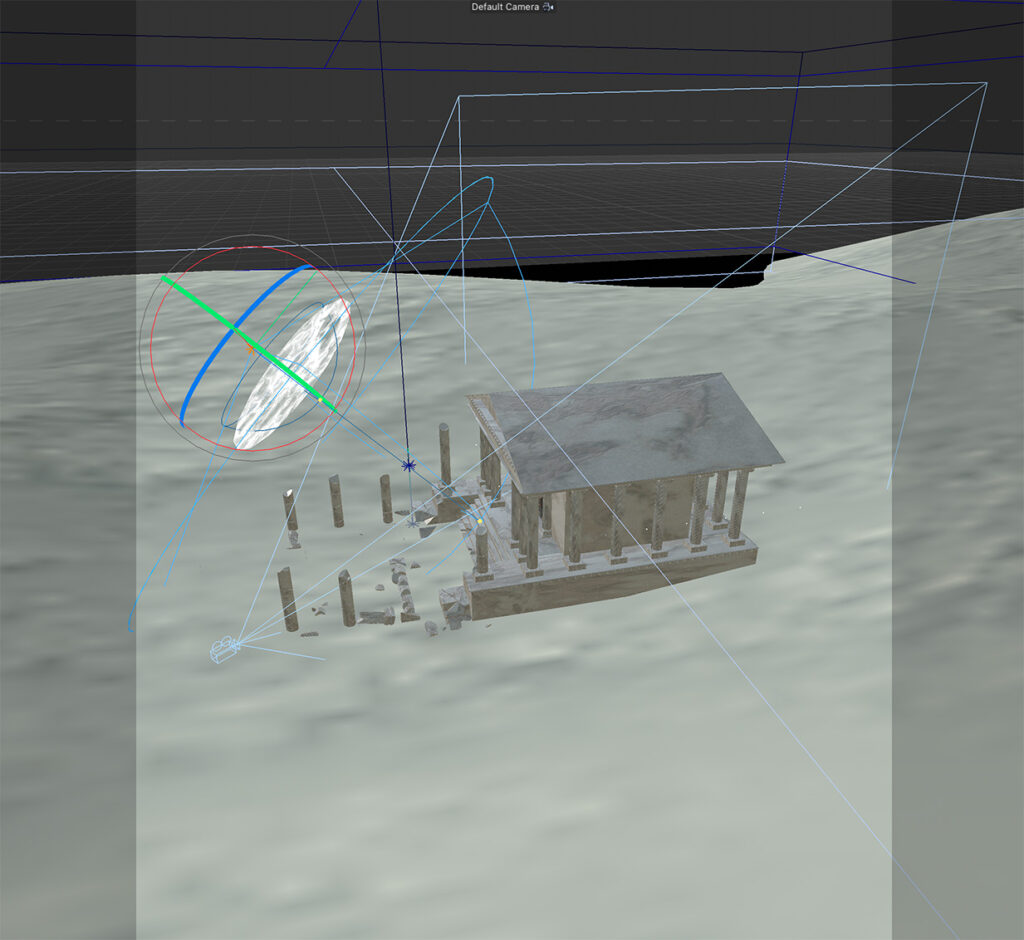
From there I went on to create a door and the steps and columns leading up to the entrance of the building. The colors that you can see are where the structure was fractured. By doing this I was able to give the ruins an old architectural feeling that it needed. The final shot of this compilation is the overview shot showing the angle of the lighting, the camera, and also the space around the scene.
Rendered Scenes
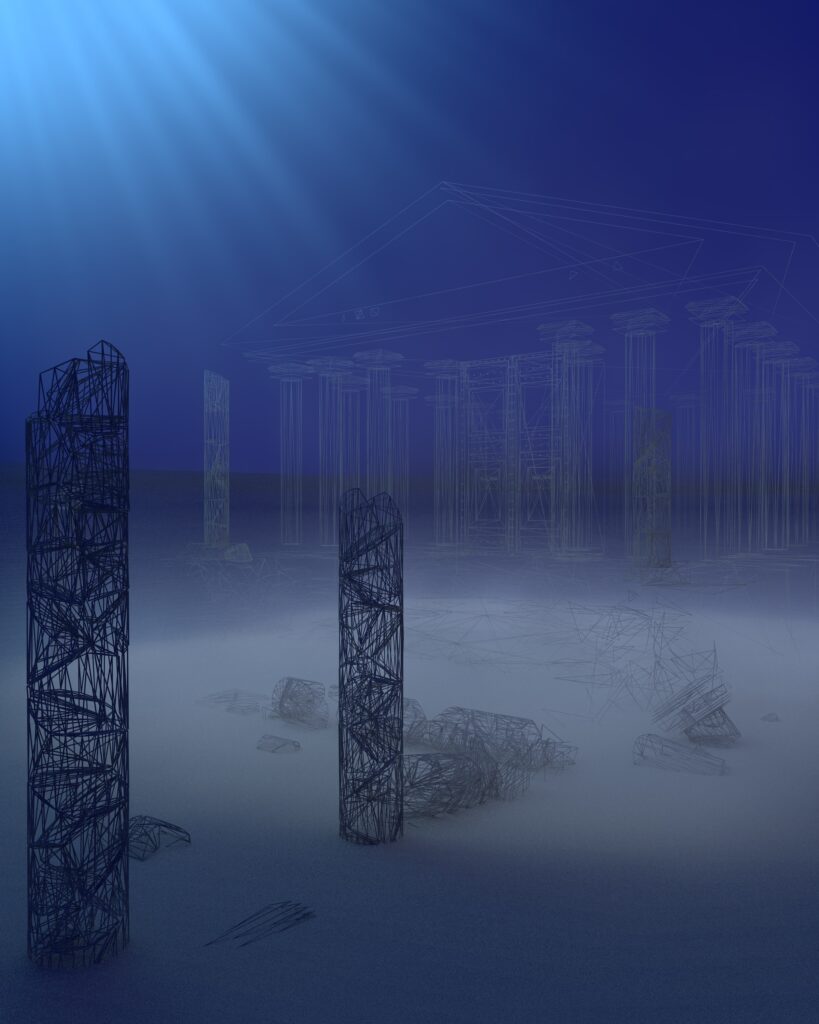
After the scene was finished, it was finally time to render. When you render your scene out in Cinema4d you are able to see some of the features that you cannot see when you’re constructing it; such as the foggy atmosphere and volumetric lights that bring the scene to life. I also surrounded the structure in sand to truly make it feel like it was underwater. After the first render was complete and I also rendered a complete wireframe version of the composition to blend the two images together. This will give the viewer the feeling of the structure being built right in front of them.
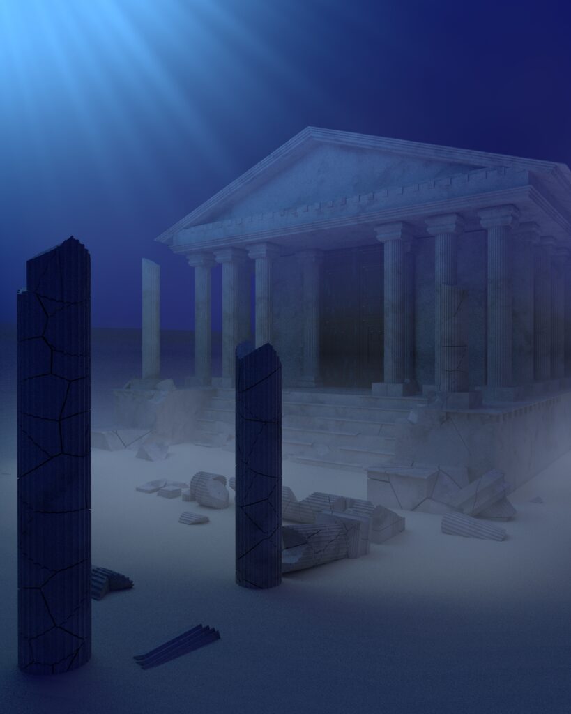
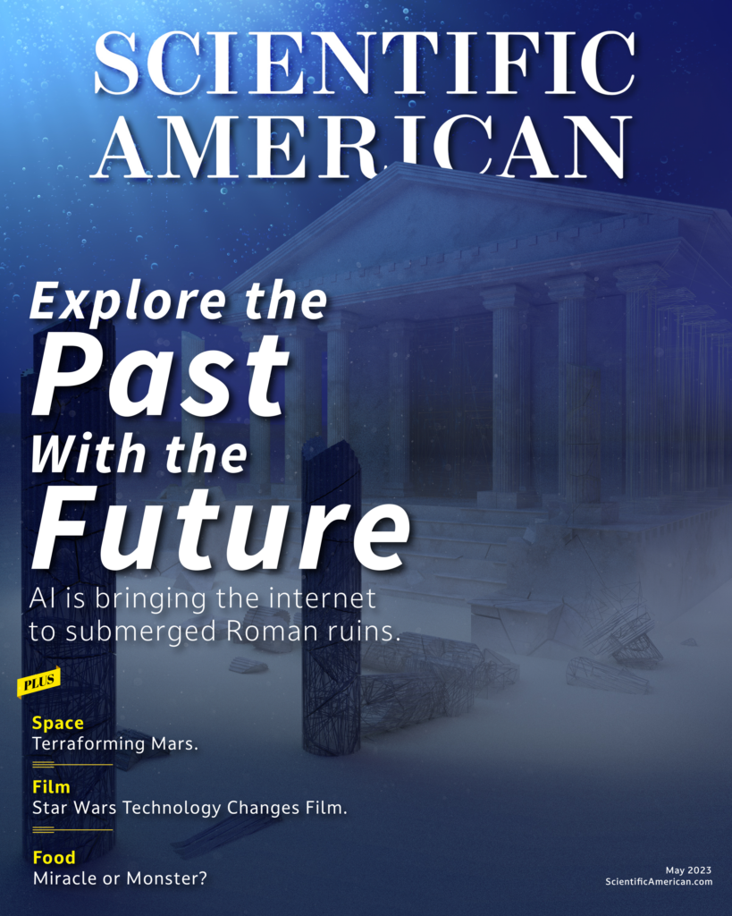
Now, here’s a look at the final magazine cover. In the final process of adding text to the image I also added some dust particles and bubbles to the scene to really give the cover some depth.

If you are looking for more information about diving and exploring the ruins you can visit the Subaia homepage here!

