The Converters Logo Design
Background Information
In this assignment we were asked to create a logo for an “upcoming rock band” called The Converters. After a logo design was complete we were also tasked with putting that design on apparel mockups and other merchandise that would be sold as shows or venues where The Converters would play.
About the Client
The Converters wanted their logo to have a biker, rock and roll vibe to it as well as an easily recognizable visual that identifies with the name of the band. Their style of music weighed heavily on the design decisions because it needed to fit what they represented.
The Challenge
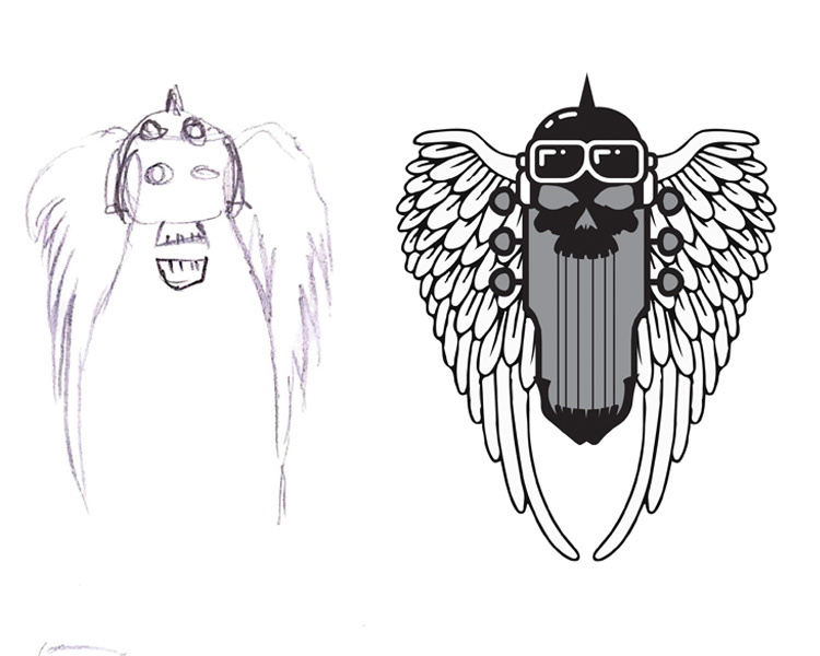
The challenge for this assignment was creating a fresh new logo that had it’s own unique characteristics for The Converters. This quick sketch evolved into a logo that I was happy with. Some things that I kept in mind when designing were, will the logo look good as a tattoo? Or will this logo look good as a sticker on a motorcycle.
The Solution
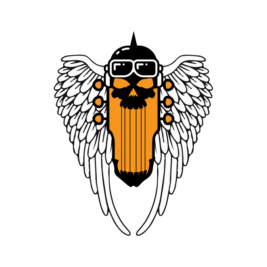
Designing the logo I tried to incorporate as many “biker and rock” assets as possible without overloading the design. It features angel wings, a guitar head, a helmet, and a skull which is connected by the strings of the guitar.
The Second Challenge
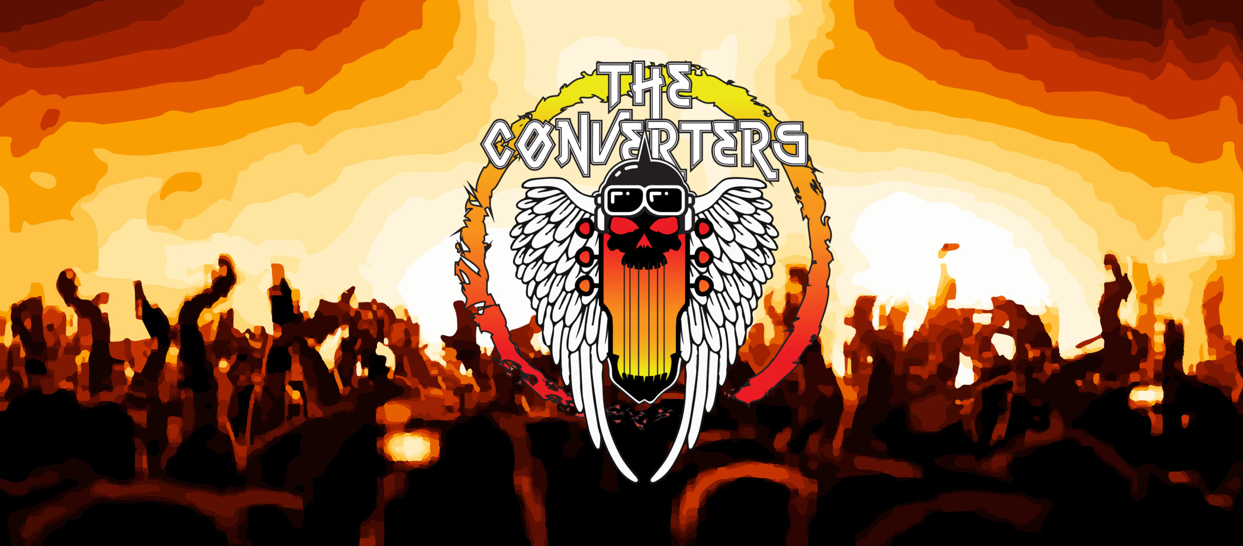
After discussion with the band there were a few things that they wanted to add to the logo. First being a circle or shape around the graphic to tie it all together and to also add text with the name of the band. The Converters also liked the color orange but thought it felt a little flat.
The Final Solution
The Process
The entire process of this developing this logo was around two weeks. Starting with sketching and research about the group and ending with creating mockups for the bands merch.

