Java Madness UX Journey
Coffee Shop UX/UI Project
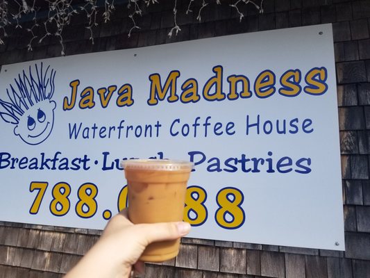
The overall objective of this project was to find a coffee shop that needed to be improved in some sort of aspect. Java Madness is a great name for a coffee shop but the logo is lacking. The bland stick figure logo causes the font to be almost unreadable. Looking at it you may not even know that the hair spells Java Madness. While designing a logo we were also tasked with doing research about the company, such as finding what they offer on their menu, what opportunities they offer to their customers, and what sort of threats could impact them negatively.

Commercial Coffee Competitive Content Audit
The two top most popular coffee shops in the country are Dunkin’ and Starbucks. With such a high influx of customers flooding their stores each day, how are other local companies going to be able to take a part of their market? The answer is to be able to offer customers something the two chain coffee shops do not. Dunkin’ and Starbucks customers are slightly different but they are both looking for a fast cup of coffee to go. Most locations have drive-thru’s which customers look to use when they’re in a hurry bringing kids to school, traveling or even doing errands.


Commercial Coffee Competitive Content Analysis
The customers that go to Dunkin’ and Starbucks regularly are more often than not, on the go, fast paced people looking for something quick and easy.
Target Coffee Shop Content Audit
Being from around the area where Java Madness I was easily able to distinguish the target persona of the customers that are going to the coffee shop. The laid back, relaxed, comfortable vibe of Java gives the people a feeling of home.
Target Persona
The target persona are very relatable to the character Crush from Finding Nemo. An easy going, relaxed “surfer dude” turtle.

Target Whitespace Analysis
Java offers food and drink options that are on the lower cost scale compared to the other restaurants in the area. They also offer the option to dine in or take your food and drinks to go. Java also offers live music and art shows to their customers every month!

Target Value Prop Canvas
The value prop canvas shows us the Products & Services, Gain Creators, and Pain Relievers versus the Gains, Pains and Jobs-to-be-Done.

Target Value Prop Analysis
The original value proposition Good People Good Food Good Coffee fits all coffee shops. Java Madness has a great name to draw in customers which the value prop should be based off of. A crazy time with crazy coffee was developed and brought to life through discussion and logo design.
Hierarchical List
Hierarchical list of all food and drinks that Java Madness has to offer to their customers.

Target Persona Journey Map
Sequence of a hypothetical customer interaction.

SWOT Diagram
The main threats and weaknesses of Java Madness are the bad reviews found on websites such as yelp. There are also tons of good reviews too but most people will pay more attention to the negative comments which will cause some potential new customers to overlook Java Madness and go somewhere else.

SWOT Analysis
Java Madness has many opportunities to offer to their customers. Being the only place that serves coffee and has live music in the area, it draws in a high amount of customers on the weekends. During the week when people are on the go and in a hurry they’re looking for something fast. If Java was able to increase the efficiency of the work being done they would be able to secure and maintain a higher amount of customers than they do now.
Target Revised Value Proposition
The value proposition started out as; Good People Good Food Good Coffee; which could be applied to any coffee shop but i wanted something more fitting for the name Java Madness. After some thinking and discussion the final value proposition came out to be A Crazy Time, with crazy coffee.
Target Logo Evolutions
Beginning sketches of logo redesign.


Target Logo Merch
Java’s new and improved merchandise.


Target Mobile Website Wireframe
Images of mobile wireframe of home, menu, merch

Target Mobile Website Prototype
Images of polished mobile home composite in mobile device


